Creating Apple's New Slide Menu with jQuery
In the world of web development, this is ancient. What you see here may no longer be a good idea or in alignment with best practices. I've left the content mostly as-is, besides minor fixes for typos or dead links.
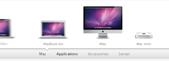
I noticed yesterday that Apple has a new product nav menu that replaced their old horizontal scroller with some new animated candy. I was impressed to see that all transitions and animations are CSS-based. Unfortunately, it will take some time before all major browsers even support this cool new CSS wizardry. Never fear—you can create a similar menu with jQuery that works in every browser, even IE6.

Guts of the menu
At its heart, this isn't a very complicated menu. You have a few hidden unordered lists that you scroll into view one item at a time, the animations have a slight easing to give the bouncy appearance, and the direction of the entrance and exit animations depend on the order you navigate through the menu (nice attention to detail).
How I set it up
The menu is made up of unordered lists inside the parent container:
1<div id="menu-container"> 2 <ul> 3 <li><a href="#"></a></li> 4 <li><a href="#"></a></li> 5 <li><a href="#"></a></li> 6 <li><a href="#"></a></li> 7 </ul> 8 <ul> 9 <li><a href="#"></a></li>10 <li><a href="#"></a></li>11 <li><a href="#"></a></li>12 </ul>13 <ul>14 <li><a href="#"></a></li>15 <li><a href="#"></a></li>16 <li><a href="#"></a></li>17 <li><a href="#"></a></li>18 </ul>19</div>The lists and list items are positioned absolutely so they pile up on top of one another, and when it's time to animate I pull out the appropriate list's items one at a time and position them with some simple math. Here's what the framework looks like:

The controls for the menu are simple as well:
1<div id="menu-controls">2 <a href="#" data-target="0">List 1</a>3 <a href="#" data-target="1">List 2</a>4 <a href="#" data-target="2">List 3</a>5</div>The
data-target attribute determines which list to animate when clicked. This target refers to the index of the list items. So target 0 refers to list 1, 1 to 2, etc. The script will add
class="active" to the selected menu button's <a> tag, so you can style accordingly.
Once the basics were down I firmed up the logic, added some animation easing, and made every piece of it customizable. The one thing I didn't do was add the animated menu indicator (a triangle in Apple's menu) that slowly animates to the active menu button. I consider that a flourish that goes along with the entire design of the Apple's site. I left my demo on the simple side so the active button just gets bolded on mine.
Demo
I created a demo page with a sample menu for four separate categories; the HTML is commented enough to explain all the options.
Update: 3/10/11
- A
switchTo(index)method has been added so you can easily manipulate the menu. It takes one parameter, the index of the <ul> you want to switch to. Note: The default controller click handlers won't start a new animation until the previous one finishes, so frantic clicking on the menu controls will not mess anything up. There is no such restriction on theswitchTomethod, so use smartly. - By default, the menu will now wait for all images in the first list to load before animating in. There is also a configuration option
preloadAllwhich will make it load all menu images before starting when set to true. - If you want to use a loading graphic, you can tell the menu where it is so it will hide it for you once all the images are loaded and ready to go.
- Updated the easing method used in transitions so looks a little smoother.
View demo source for more explanation.