Apple-Style Nav Menu
In the world of web development, this is ancient. What you see here may no longer be a good idea or in alignment with best practices. I've left the content mostly as-is, besides minor fixes for typos or dead links.
I'm a big fan of using sprites for navigation menus. While they don't offer the flexibility of a solely HTML & CSS menu due to the fact that you have to create a new graphic every time you want to change a menu item, sprites do offer you infinite styling possibilities. Apple's website is a well-known example of sprite-driven navigation, so I'll use that as the inspiration and walk through how to create something similar.
The purpose of this tutorial is to walk you through setting up a sprite-driven nav menu, and the HTML/CSS required to make it work. The fact that it mimics Apple's menu is just to give you an example of a well-known design and show you how to re-create it while learning how to use sprites. The emphasis isn't on the style, which is why I don't show the steps of creating the demo sprite, but rather the code behind it.
There are three steps to this tutorial: Making the sprite, setting up the HTML and lastly, writing the CSS that makes it work.
1. The Sprite
This is where you get to be creative. Sprites with fixed-width buttons make it easier when you get to the CSS, and that's what I'm using for this tutorial. You need to be pixel-perfect when setting up your different states so they look right when used in your menu. Guides are your friend:
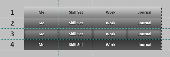
The first thing you need to do is a little math. In my example, each button will be a fixed size of 114 x 36px, so each row (state) of the menu is 456 x 36px. Then you must decide how many states your buttons will have—this tutorial will use 4 states:
- Inactive
- Hover
- Click (mousedown)
- Active page
So, the total size of my demo sprite will be 456 x 144px. Figuring this out ahead of time based on your own design will make creating your sprite much faster. I recommend setting up your guides first, and doing all the buttons for the first state. Then just copy it down to the next state, edit and repeat until done. The PSD I used for this tutorial is included with the download at the end of this post.
View the completed sprite used for this tutorial.
2. HTML
We'll use an unordered list to layout our menu:
1<ul id="nav">2 <li><a class="me" href="#"><span>Me</span></a></li>3 <li><a class="skill" href="#"><span>Skill Set</span></a></li>4 <li><a class="work" href="#"><span>Work</span></a></li>5 <li><a class="journal" href="#"><span>Journal</span></a></li>6</ul>We'll give the <ul> the id "nav", and each link has a class: me, skill, work and journal. For accessibility, the text for what each button does is enclosed in span tags. That's it, we don't need to touch the HTML again until later.
3. CSS
This is where everything happens. First, set up the menu:
1#nav{ 2 list-style-type:none; 3/* Remove bullet points */ 4 width:456px; 5/* Overall width of menu */ 6 height:36px; 7/* Overall height */ 8 margin:50px auto; 9/* For demo display purposes, not required */10}11#nav li{12 float:left;13/* So all items will display in a row, and not on top of each other */14}15#nav li a{16 background:url(nav.png) no-repeat;17/* Tells each link to use the sprite for its background */18 outline:none;19/* Gets rid of the dotted border in some browsers when you click */20 display:block;21/* Gives each button substance */22 width:114px;23/* Width of button */24 height:36px;25/* Height of button */26}27#nav li a span{28 display:none;29/* Hides the span text */30}Now, we set up the initial state of each button:
1#nav li a.me{ 2 background-position:0 0; 3} 4#nav li a.skill{ 5 background-position:-114px 0; 6} 7#nav li a.work{ 8 background-position:-228px 0; 9}10#nav li a.journal{11 background-position:-342px 0;12}What that does is set the appropriate background sprite position for each button. If this doesn't make sense, imagine two stacked pieces of paper, the one on the bottom has our sprite on it, and the top piece has a small box cut out of it. What we're doing is sliding the bottom piece of paper to different positions so different sections are shown through the hole in the top sheet. The two values for background-position are the X & Y coordinates based off a top-left registration point.
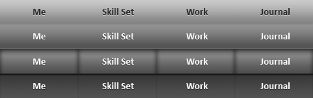
Where we are at so far:

You can see each button is displaying as it should, now let's make it interactive. First we'll add hover:
1#nav li a.me:hover{ 2 background-position:0 -36px; 3} 4#nav li a.skill:hover{ 5 background-position:-114px -36px; 6} 7#nav li a.work:hover{ 8 background-position:-228px -36px; 9}10#nav li a.journal:hover{11 background-position:-342px -36px;12}All we did was bump everything down 36px (button state 2), and now we have hover interaction.

So far so good, now let's make it look like the button is pressing down when you click on it, by bumping everything down another 36px (button state 3):
1#nav li a.me:active{ 2 background-position:0 -72px; 3} 4#nav li a.skill:active{ 5 background-position:-114px -72px; 6} 7#nav li a.work:active{ 8 background-position:-228px -72px; 9}10#nav li a.journal:active{11 background-position:-342px -72px;12}Our click interaction is working. To make it look like the button is going down, I bumped the text in state 3 and 4 down 1px when I was making my sprite graphic.

Now all that's left is to give the button its ON state. For this we go back to the HTML and add
class="on" to the button that we want to be active. Let's make “Journal” active:
And the CSS for each ON state, moving the background down a final 36px (button state 4):
1#nav li a.me.on{ 2 background-position:0 -108px; 3} 4#nav li a.skill.on{ 5 background-position:-114px -108px; 6} 7#nav li a.work.on{ 8 background-position:-228px -108px; 9}10#nav li a.journal.on{11 background-position:-342px -108px;12}Now we have all states working properly. In the menu HTML for each page of your site, just add
class="on" to the appropriate link, and that's it!

Not so fast…
You didn't think we could make such a nice menu without adding some sort of fix for the red-headed step-child of browsers, did you? With the code as it is now, the ON button still reacts to hover in IE6. To get around it we have to turn this original code:
1#nav li a.whatever.on{2 background-position:-342px -108px;3}Into this:
1#nav li a.whatever.on:link,2#nav li a.whatever.on:hover,3#nav li a.whatever.on:active,4#nav li a.whatever.on:visited{5 background-position:-342px -108px;6}For each button, we have to explicitly say that each state (link, hover, active and visited) for a link with
class="on" should have the same background position. Adjust accordingly for each of the buttons, and you're golden. A relatively easy fix, just adds a little extra bloat, but both the HTML and CSS will validate.